Evolution of the NHL Defenceman - Part 7
Defencemen being good at both ends of the ice will help a team perform well, but if we have to have one or the other, a difference emerges.
Over the course of this series, we have looked at 5-on-5, the power play, and the penalty kill. We have reviewed changes in defensive involvement in shot attempts, shots on goal, expected goals, and various tracking stats. We have also dug into how much the changes have helped or hurt their teams.
One thing we haven’t dug into much – other than expected goals generated by defencemen – are expected goals models. At Evolving Hockey, they have developed their Regularized Adjusted Plus-Minus model, or RAPM. What this does is account for a player’s teammates, the opponents they face, their zone starts, and more to normalize a player’s usage and drill down to their actual impact offensively and defensively. RAPM can be used for goal-scoring, expected goal, and shot attempt impact at even strength, on the power play, and on the penalty kill. For today, we’ll home in on expected goals at even strength. For this model, even strength excludes empty-net situations, so it’s just 5-on-5, 4-on-4, and 3-on-3.
The first area we’ll focus on is the expected goals-for (xGF) portion of their model. Positive numbers here are good – it means they are driving xGF for their respective team, which approximates their offensive impact. If we go back to 2007, split defencemen from each season into groups of above 0.0 xGF/60 and below 0.0 xGF/60, and then calculate the goal share of those two groups, what do we find? Well:
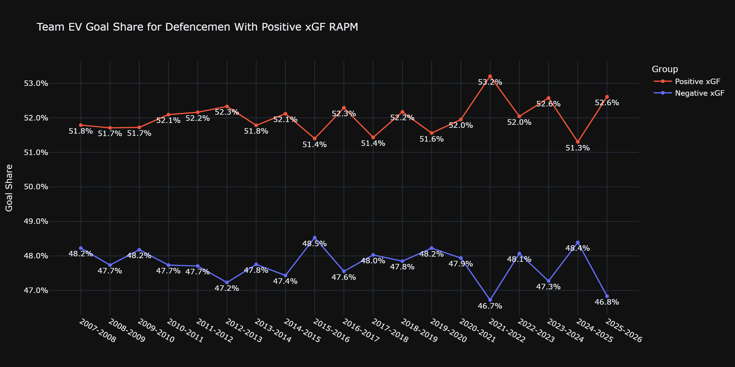
Unsurprisingly, the group of players driving positive xGF/60 rates outperformed the group of players with a negative xGF/60 rate in each season, and it wasn’t even close. In the least shocking development of our series so far, driving expected goals-for has led to perennially good outcomes.
That is only half the equation, though. Knowing above-average offensive defencemen were able to consistently drive good outcomes for their team is only useful if we also figure out what happened defensively. Here, we’ll isolate the expected goals against (xGA) portion of the model. For xGA, negative numbers are good because it means they’re suppressing the expected goals generated by the opposition. If we split our players into groups of above 0.0 xGA (bad) and below 0.0 xGA (good), what do we get? We get something familiar:
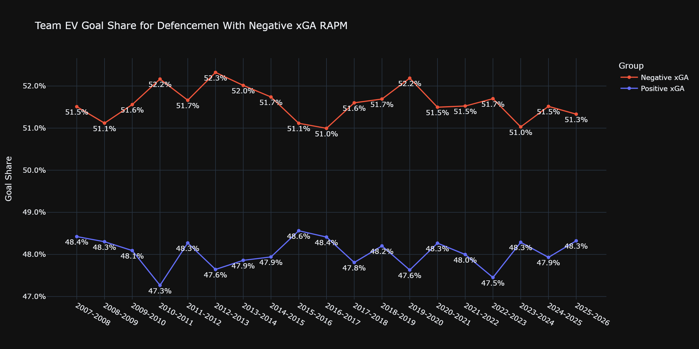
Again, we see a clear impact in every season as the group with a negative xGA was able to reach, or surpass, a 51% goal share in each campaign since 2007-08 whereas the group with a positive xGA never reached 49%. In the second-least shocking development of the series so far, being able to suppress the shot quality of the opponent leads to good outcomes.
Being good offensively and being good defensively are both helpful, which is a real “Thanks, tips” moment. But we do those steps for what comes next: what if we take the positive xGF group from the first graph, the negative xGA group from the second graph, and see how their goal shares compare each season? That is where things get interesting:
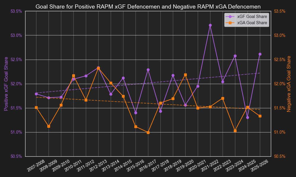
The dotted lines are the trends of each group over the last 19 seasons. Early on, the positive xGF group generally outperformed the negative xGA group, but the results were a bit more mixed. There was one season (2012-13) with virtually identical outcomes, and the negative xGA group had a higher goal share than the positive xGF group in four of the other 12 seasons from 2007-2020. It was generally better to have superior offensive impact, but the defensive impact group had a better goal share once every three years.
That trend has changed because the positive xGF group has had the higher goal share in five of the last six seasons. Additionally, the gap is growing as the two seasons of the largest goal share differential between the two groups, regardless of which group had the higher goal share in any season, are from the last five years (2021-22 and 2023-24). If we go further, three of the four largest differentials are also from the last five years (add 2025-26 to that group). The four largest differentials are from the last decade (add 2016-17). After those four years, the differential is basically cut in half, so not only have the four largest goal share differentials come in the last 10 years and all come from the positive xGF cohort, but they are in a group far above the next-closest seasons.
We can take this a step further. Plenty of defencemen who are above-average offensively are also above-average defensively, and vice versa. What if we looked at offensive defencemen and defensive defencemen? To do this, we are going to find every instance where a player had both an xGF/60 and xGA/60 above zero (above-average on offence, below-average on defence) and every instance where a player had an xGF/60 and an xGA/60 below 0.0 (below-average on offence, above-average on defence). After putting the players into those two groups, we’ll find their combined goal share at even strength in each season and see what we get. For anyone who has read the first six entries of this series so far, you can probably guess what’s coming:
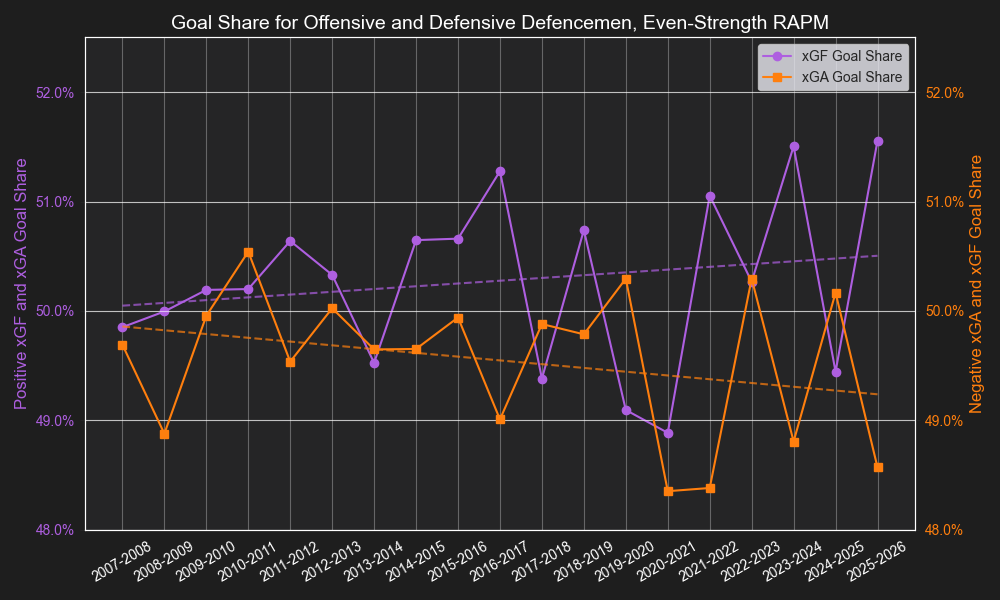
This is similar to what we saw in the graph above: somewhat close results back in the late 2000s/early 2010s, the gap grows in the mid-2010s, and some very drastic differences in recent seasons. In fact, the largest goal share difference between the two groups came in 2025-26, the next-largest was in 2023-24, the third largest in 2021-22, and the fourth largest in 2016-17, all of them belonging to the group of offensive defencemen. And, as with the last graph, the season with the fourth largest differential far exceeded the next-closest season (almost 90% larger). Those four seasons are in a tier of their own, so offensive defencemen have greatly outperformed defensive defencemen for several years.
It should be noted that this is just one model. We may find varied results if we use data from MoneyPuck, Natural Stat Trick, or Puckalytics. However, over the course of this series we’ve seen that offensive involvement among defencemen has increased consistently over the last 20 years, and that increased involvement via their offensive tracking data has led to improved team results over the last 10 years. I have confidence that while there may be some differences between the various public models, we’ll find similar results.
Next week, we’ll take one final look at the tracking data to see just how much (or how little) bad offensive defencemen are hurting their teams.